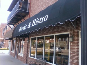
It is certainly hard to miss now, at least if you are driving down Main Street in Broken Arrow, Oklahoma. Them’s some big letters.
The first bit of official advertising for the new location is courtesy of an alteration to the storefront awning.
I’ve been asked why I didn’t put the name up there instead of Books & Bistro. There’s a pretty simple answer: When someone says “I’m going to McDonald’s,” there is no question about what they’re after. I don’t anticipate ever getting to that degree of notoriety, so I figured it would make more sense to describe what is inside the store rather than who owns it.
Besides – when paying by the letter, “McHuston Booksellers & Irish Bistro” adds up to a pretty penny.
As for the looks, I could not be happier. The letters are larger than I had imagined they would be, a pleasing surprise, and already someone has come in after parking to check out the inside of the place.
Sometimes I ask how a customer found the store and sometimes I don’t, but I know from visitors at the old location that the sign out front was my best advertising expenditure. Compare to the sign expense, I paid a lot more for newspaper ads over the five years at Oak Crest shopping center, but it might have been a better idea to just put that money toward a newer, bigger sign.
Did you ever spot one of the newspaper ads?
Goes to show ya.
I am in hopes that the awning will do the same thing toward drawing in customers as the vinyl lettered plywood sign did. (That’s now parked at the back door, slightly faded, but doing what it can from that vantage point.)
Maybe I’ll take down the HP printer paper sign that I taped up to the inside of the glass, the one that inspired a woman to tell me, “It looks like it was made on a computer.”
The lettering on the awning, on the other hand, looks pretty official.

Leave a Reply